Fun with CSS Transforms in Firefox and Webkit
- published:
- 2009.02.17
- topics:
- css
- javascript
- mobile
WebKit based browsers like Safari have had CSS Transforms for quite awhile now, allowing developers to skew, translate, rotate, and scale HTML elements or the entire page with CSS alone. The Firefox 3.1 betas also now have CSS transformations. These CSS properties can also be animated with JavaScript, although finding documentation for how to do it in Firefox 3.1 was a bit of a hassle. Let me show you how it is done.
Update: CSS Transforms are now available in Safari, Chrome, Firefox 3.5+, IE9+, and Opera. Check out my patch that enables setting and animating CSS Transforms with jQuery.
Quick Review of the Basics
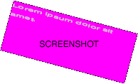
First, a quick rundown of the properties themselves. For WebKit, the CSS property is -webkit-transform and for Firefox the property is -moz-transform. (Update: For IE9 the property is -ms-transform.) These are browser specific implementations of the draft CSS3 property transform. The value for these properties should be a list of transformation functions which will be applied to the styled element in order. Some of these functions include skew(), translate(), rotate(), and scale(). Refer to the CSS Transform announcements from WebKit and Mozilla for more information. A short example using these properties without animation follows. If you are using Safari, Google Chrome, WebKit, Firefox 3.5+, or IE9 (Platform Preview 7+) the box in the center should look like the screenshot.
Lorem ipsum dolor sit amet.
Lorem ipsum dolor sit amet.
<style type="text/css" media="screen">
.square {
    width: 144px;
    height: 144px;
    background: #f0f;
    margin-right: 48px;
    float: left;
}

.transformed {
    -webkit-transform: rotate(15deg) scale(1.25, 0.5);
    -moz-transform: rotate(15deg) scale(1.25, 0.5);
    -ms-transform: rotate(15deg) scale(1.25, 0.5);
    transform: rotate(15deg) scale(1.25, 0.5);
}
</style>
<div class="square"><p>Lorem ipsum dolor sit amet.</p></div>
<div class="square transformed"><p>Lorem ipsum dolor sit amet.</p></div>
Finding the Transformation Properties in the DOM with JavaScript
In order to animate these CSS Transform properties with JavaScript, we need to find the HTML element whose CSS properties we want to animate in the page DOM, and then find the specific CSS properties we want to change in the DOM node.
WebKit in particular makes this very easy. The transform properties can be accessed in a variety of ways. Webkit and Safari users should see 3 rotated boxes.
This is tdiv1.
This is tdiv2.
This is tdiv3.
document.getElementById('tdiv1').style['-webkit-transform'] = 'rotate(15deg)';
document.getElementById('tdiv2').style.webkitTransform = 'rotate(15deg)';
document.getElementById('tdiv3').style.WebkitTransform = 'rotate(15deg)';
Firefox 3.1 turns out to be more stubborn and requires case sensitive style.MozTransform (or the equivalent style['MozTransform']). Firefox 3.1+ users should see a single rotated box.
This is tdiv4.
document.getElementById('tdiv4').style.MozTransform = 'rotate(15deg)';
It wasn't actually until after I found this quirk about Firefox that I realized WebKit even supported style.WebkitTransform, so in the meantime for Firefox I was trying style.mozTransform and style['-moz-transform'] — neither of which work! I couldn't actually find any information online about what the CSS Transform property was named in the DOM nodes for Firefox, and I almost had myself convinced that you couldn't change it via JavaScript. But, I was very determined, so I dipped into the Firefox 3.1 source code, and I found my answer on line 9 of this diff file.
Update: For IE9 (Platform Preview 7+), the JavaScript property for CSS3 transforms is msTransform.
Deciding Which Property to Use
If we want our animations to work in both WebKit and Mozilla browsers then we need a method to detect whether we should be using the property MozTransform or WebkitTransform. We also want to build in some forward compatibility by checking to see if the CSS property transform is defined. Here is a straightforward method of detection to best demonstrate the concept:
(Updated to show support for IE9 and Opera.)
function getTransformProperty(element) {
    // Note that in some versions of IE9 it is critical that
    // msTransform appear in this list before MozTransform
    var properties = [
        'transform',
        'WebkitTransform',
        'msTransform',
        'MozTransform',
        'OTransform'
    ];
    var p;
    while (p = properties.shift()) {
        if (typeof element.style[p] != 'undefined') {
            return p;
        }
    }
    return false;
}
Animating the CSS Transformations with JavaScript
Now that we have a way of identifying which CSS Transform property to modified for the current browser, we can animate that property. The most basic example of animation is a persistent change over a timed interval using the JavaScript built-in function setInterval().
This is tdiv5.
var div = document.getElementById('tdiv5');
var property = getTransformProperty(div);
if (property) {
    var d = 0;
    setInterval(
        function () {
            div.style[property] = 'rotate(' + (d++ % 360) + 'deg)';
        },
        100
    );
}
Moving on to more complex animations, or animations based on user action, quickly becomes more difficult. As I'm sure you already have noticed, many JavaScript libraries have popped up over the last several years — jQuery, Prototype, and YUI just to name a few — and they all tend to deal with the tricky subject of event based animations their own way. The animation tools for my current JavaScript library of choice, jQuery, sadly fail us when it comes to CSS Transformations. The following code samples do not work as expected:
//
// AGAIN, THESE DO NOT CURRENTLY WORK. YOU CAN'T DO IT THIS WAY!
// KEEP READING FOR HOW TO DO IT CORRECTLY.
//
$('#tdiv5').click(function () {
    $(this).animate({WebkitTransform: 'rotate(15deg)'}, 1000);
});

$('#tdiv5').click(function () {
    $(this).animate({MozTransform: 'rotate(15deg)'}, 1000);
});

$('#tdiv5').click(function () {
    $(this).animate({transform: 'rotate(15deg)'}, 1000);
});
I have filed a feature request. Hopefully, when jQuery supports these CSS properties it will internally make the distinction between MozTransform and WebkitTransform. In the meantime I may explore some plugin options. Update: Check out my jQuery patch that adds support!
Animating CSS Transformations with CSS Transitions
One thing that WebKit based browsers like Safari and Chrome currently have that even Firefox 3.1 doesn't have yet are CSS Transitions. This powerful tool lets you create animations in and out of the CSS :hover state, for example, using pure CSS and no JavaScript. Here are a couple quick demos best enjoyed in WebKit or Safari:
This is tdiv6. Hover for "3D Pop-Out" effect.
This is tdiv7. Hover for "Cinema Newspaper" effect.
#tdiv6 {
    -webkit-transition: -webkit-transform 0.1s ease-in;
}

#tdiv6:hover {
    -moz-transform: scale(1.1);
    -webkit-transform: scale(1.1);
    transform: scale(1.1);
    -moz-box-shadow: 2px 2px 10px rgba(255, 255, 255, 0.6);
    -webkit-box-shadow: 2px 2px 10px rgba(255, 255, 255, 0.6);
    box-shadow: 2px 2px 10px rgba(255, 255, 255, 0.6);
}

#tdiv7 {
    -webkit-transition: -webkit-transform 0.5s ease-in;
}

#tdiv7:hover {
    -moz-transform: rotate(360deg) scale(2);
    -webkit-transform: rotate(360deg) scale(2);
    transform: rotate(360deg) scale(2);
}
These properties have a lot of potential for subtle user visual feedback, and also for richly interactive web content. Of course, they could also quickly become far more annoying than even <blink> or <marquee>. With CSS Transforms still only available in beta versions of Firefox, and not available in Internet Explorer, they currently have limited practical use. With Safari being the exception to the rule here, iPhone web apps are one place where these CSS3 draft properties can shine.