Apestronauts is a multiplayer game of banana warfare developed in 48 hours by Team Watermelon Sauce for the Node Knockout competition. You can play online with your friends at apestronauts.com.
The game was written in JavaScript with a Node.js server using Socket.IO for realtime WebSocket communication. I created some notes for the JavaScriptMN meetup if you'd like to learn more about the development of Apestronauts.
Being fairly new to node.js, and even newer to the use of Socket.IO, I had a very interesting morning exploring some of the behaviors of Socket.IO. I thought I'd share the things that raised my eyebrows. There were some good lessons hidden in a basic Hello World example. There was also a really interesting question posed by the feature of Socket.IO that allows for a callback to be executed as an acknowledgement that a sent socket message was received.
I don't want to spend a ton of time on getting started with node.js or learning Socket.IO. But you should know that I'm just talking about a default, easy to replicate install of node and io. All I basically did is brew install node, curl http://npmjs.org/install.sh | sh, npm install socket.io and I'm off writing realtime code.
Hello World Has Surprise Lessons
The first thing I noticed is that it is a bit surprising — even alarming — how little you need to get a hello world example working. Let me show you the example and then explain the alarming part.
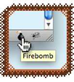
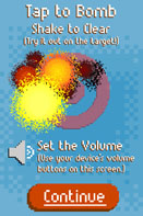
My project Firebomb is a Firefox plugin, a browser bookmarklet, and an iOS App. Firebomb lets you pretend to blow stuff up with 8-bit explosions. I'm sure you are probably familiar with Firebug, the ubiquitous debugging plugin for Firefox.
"If you can't fix a bug with Firebug, blow it up with Firebomb!"
Firebomb started out as a tongue-in-cheek parody of Firebug that I originally did for the 10K Apart Contest in 2010. Quality stress relief! Firebomb has since evolved from the original gag and developed a life of its own.
Get Firebomb for Firefox and Other Browsers
My Firebomb plugin for Firefox 4 and 5 was developed with the new Mozilla Add-on SDK that hit its 1.0 release in June 2011. Originally called JetPack, the Add-on SDK allowed me to build out a true plugin for Firefox using a smart JavaScript API. This was a really quick and fairly painless process. I definitely recommend the SDK for web developers looking to do a Firefox plugin. I also made Firebomb Lite as a browser bookmarklet so you could have the joy of firebombing Internet Explorer... I know you want to!
Firebomb for Firefox and the Firebomb Lite bookmarklet are both free and available for download today! Use them whenever you need more firepower than Firebug alone!
Buy Firebomb AR for iOS - Blow Stuff Up in Augmented Reality
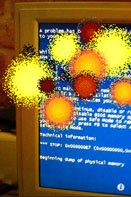
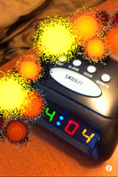
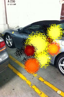
I made Firebomb AR for iOS because I also wanted to bring the fun of 8-bit explosions (including gratuitous chippy kaboom sound effects) to the world outside of web browsers. Just like The Kids in the Hall used to pretend to crush heads between their fingers, you can launch the Firebomb AR App, aim your camera at a target, and pretend to blow it up by tapping the screen.
Firebomb AR is great for taking care of crashing computers, alarm clocks, piles of work papers, your boss… It's old school stress relief. Available in the App Store today for 99 cents! (Not for use on lolcats. Aim away from face. Batteries included.)
Buy Firebomb AR for yourself, or as a fun gift for the special geeks and kids in your life. (Big, grown-up kids, too!) Your purchase will support an independent App farmer who uses 100% organic 1s and 0s, and it will greatly encourage his odd sense of humor.
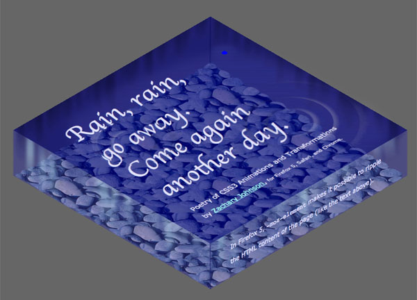
This CSS3 moving poem shows how you can use just a little CSS3 magic to create some refracting water ripples that run right through a page's HTML content. Raindrops and ripples are created with border-radius, box-shadow, and CSS3 scale transforms -- and they are animated with CSS3 animations! Firefox 5 lets us refract not just an image but actual page DOM content via smart use of -moz-element. This YouTube video explains it a bit more.
I spoke at the Twin Cities, Minnesota chapter of the International Game Developers Association on Wednesday, June 8 about the current state of making games with JavaScript and HTML5. Here are my slides.